통합 검색
통합 검색
FOR
SUCCESSFUL
DESIGN

LOGO DESIGN
로고 디자인
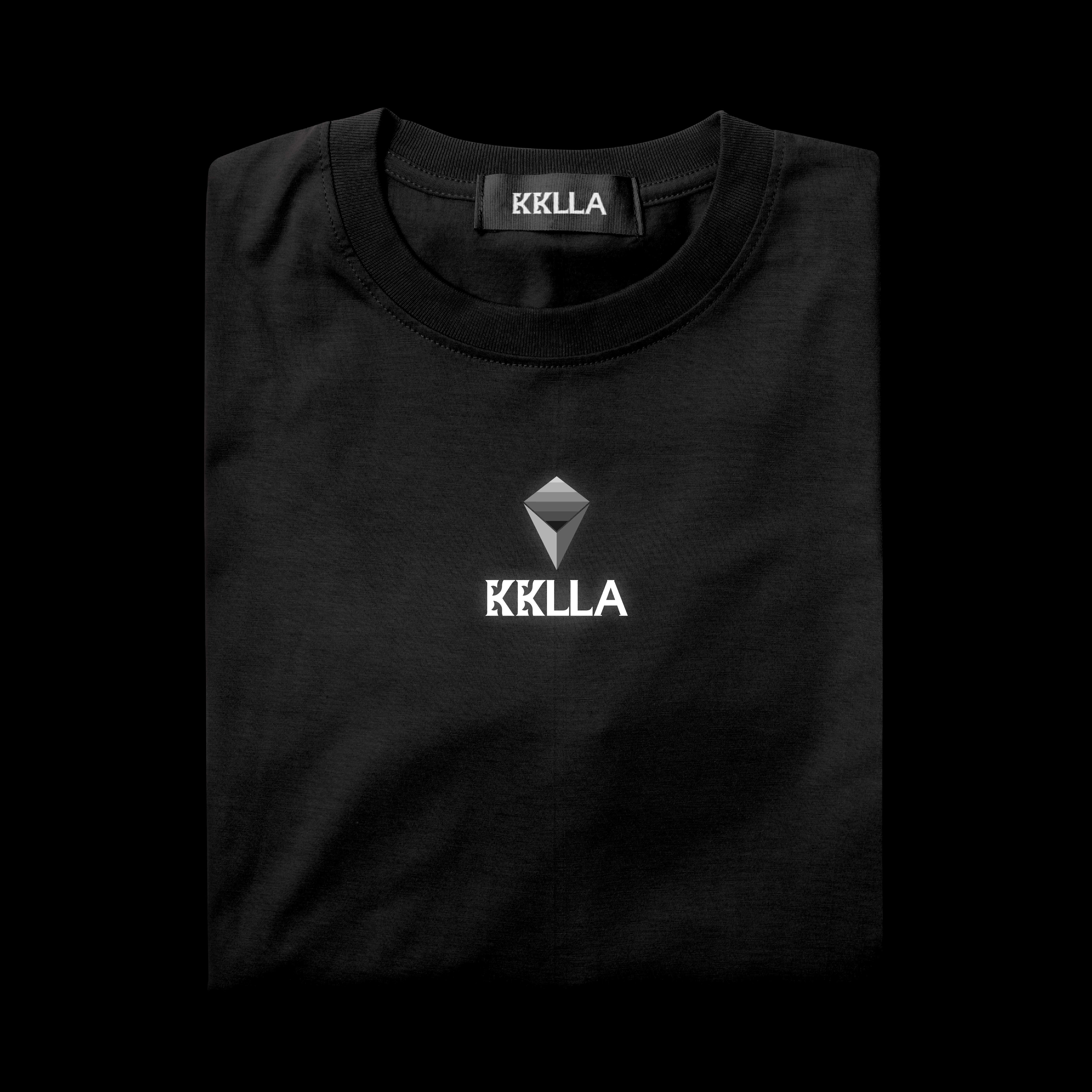
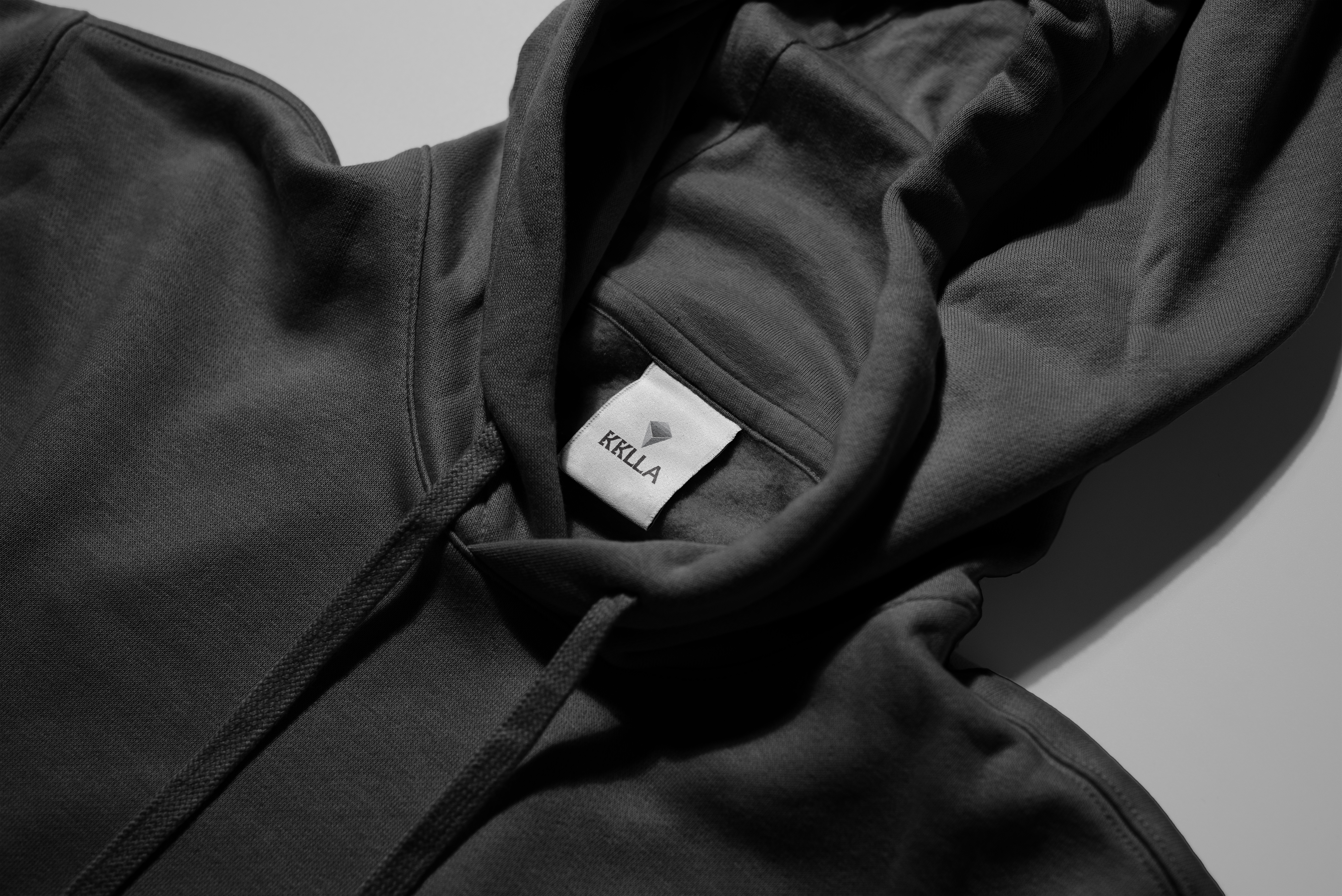
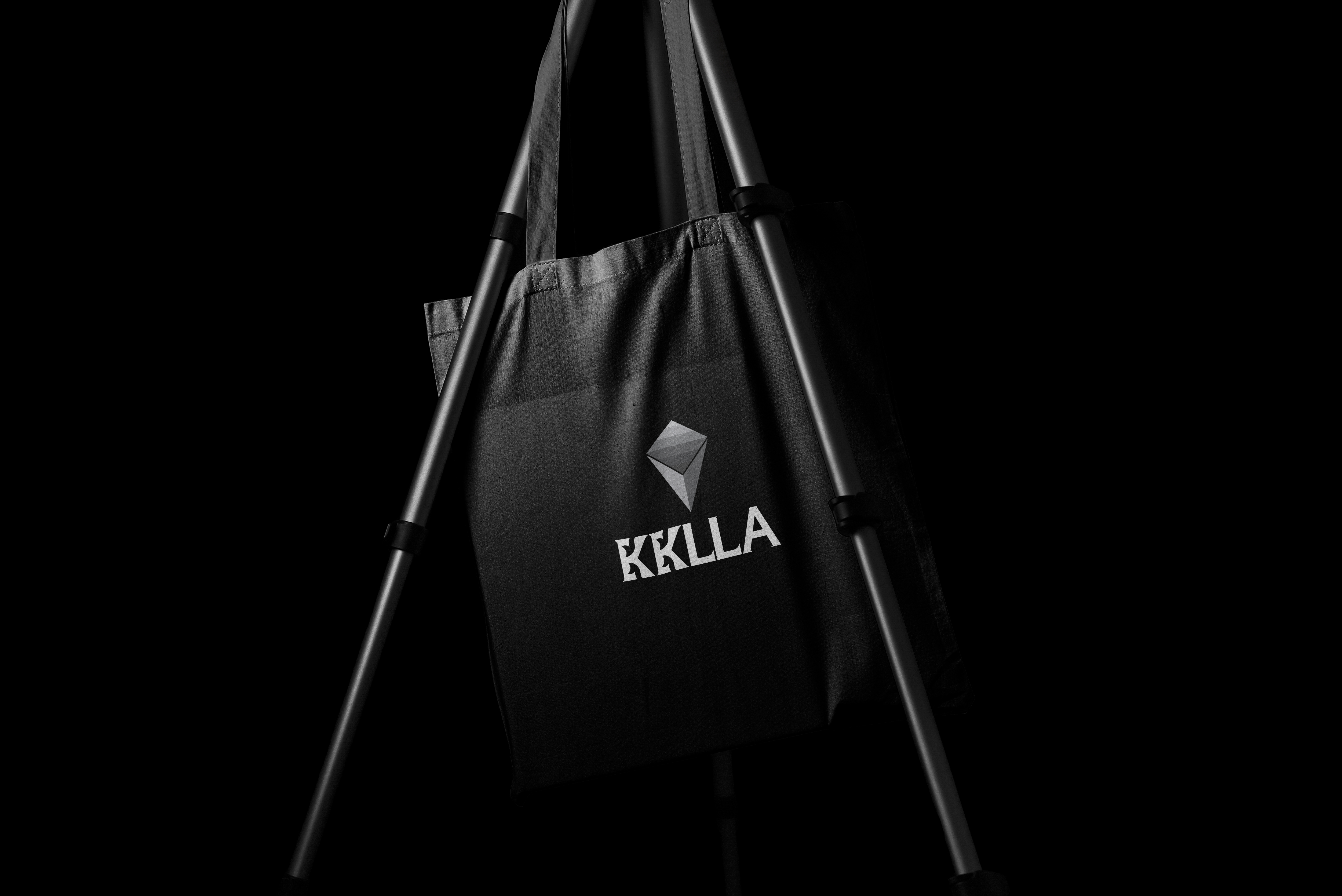
KKLLA
KKLLA is a billiards sportswear brand that emphasizes sharp details, reflecting focus and dynamism. It aims to inspire customers to lead lives that embody these qualities while achieving a perfect balance in their daily routines, pursuing a modern and sophisticated lifestyle value.
“Attract the charm.”
The logo design features a rhombus shape, symbolizing precision, representing movement, direction, and the goal point. It expresses focus in billiards and the determination toward victory.
The logotype is inspired by the fox, an animal known for its allure, symbolizing accuracy and concentration in technique. The elegant and refined silhouette of the fox highlights KKLLA’s stylish and contemporary brand identity.
With its modern and sophisticated sensibility, the KKLLA sportswear brand embodies a charming brand identity that enhances the perfect balance of everyday life.
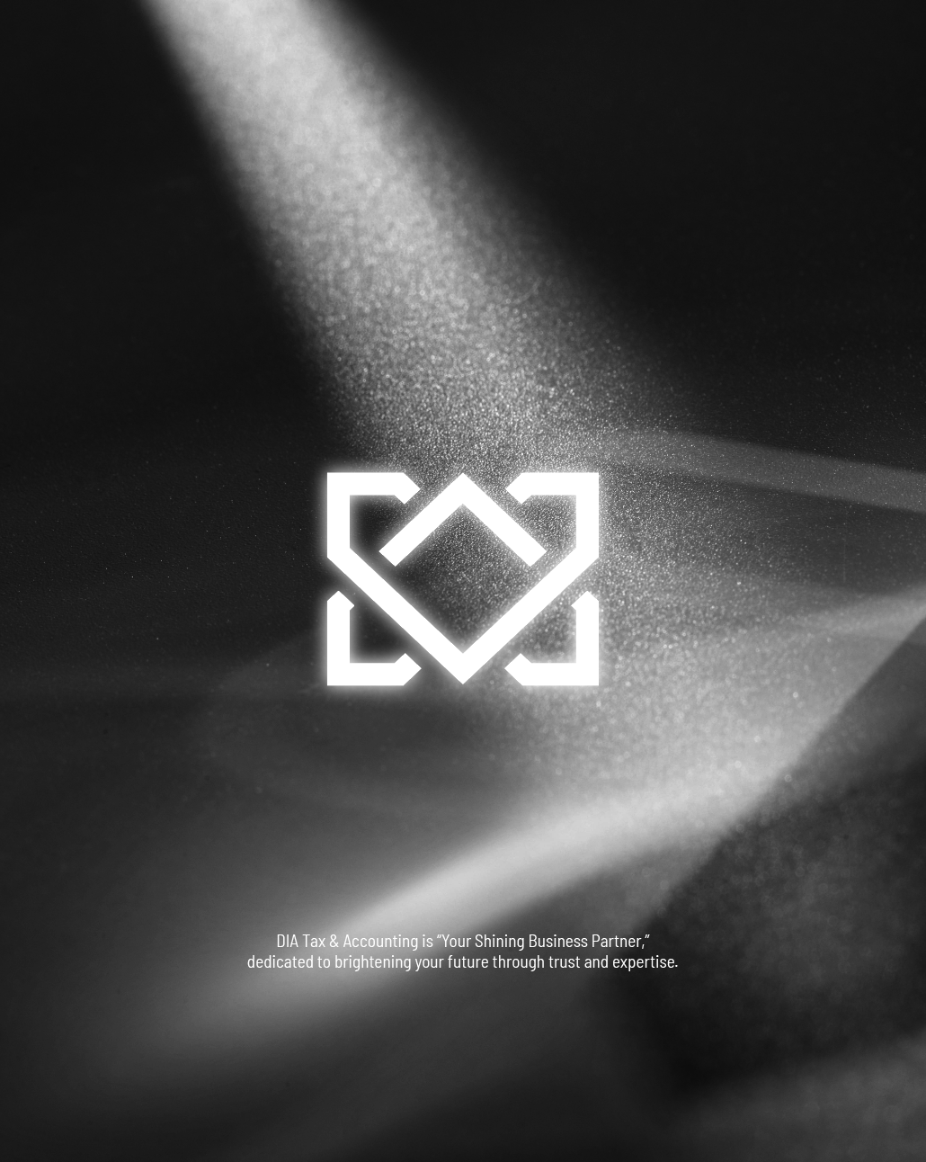
DIA TAX
ACCOUNTING
The DIA Tax & Accounting logo design embodies the strength and value of a diamond, symbolizing precision and trust as it safeguards clients’ businesses. The open four-directional shape represents partnership, growth, and expansion together with clients.
Connected to the slogan “Your Shining Business Partner,” the design conveys DIA’s role as a reliable ally that helps clients’ success shine brilliantly like a diamond.
Through DIA Tax & Accounting, we aim to support businesses to grow and shine on a solid foundation, pursuing the value of being a trusted partner that builds success together with accuracy and reliability.


Branding
브랜딩
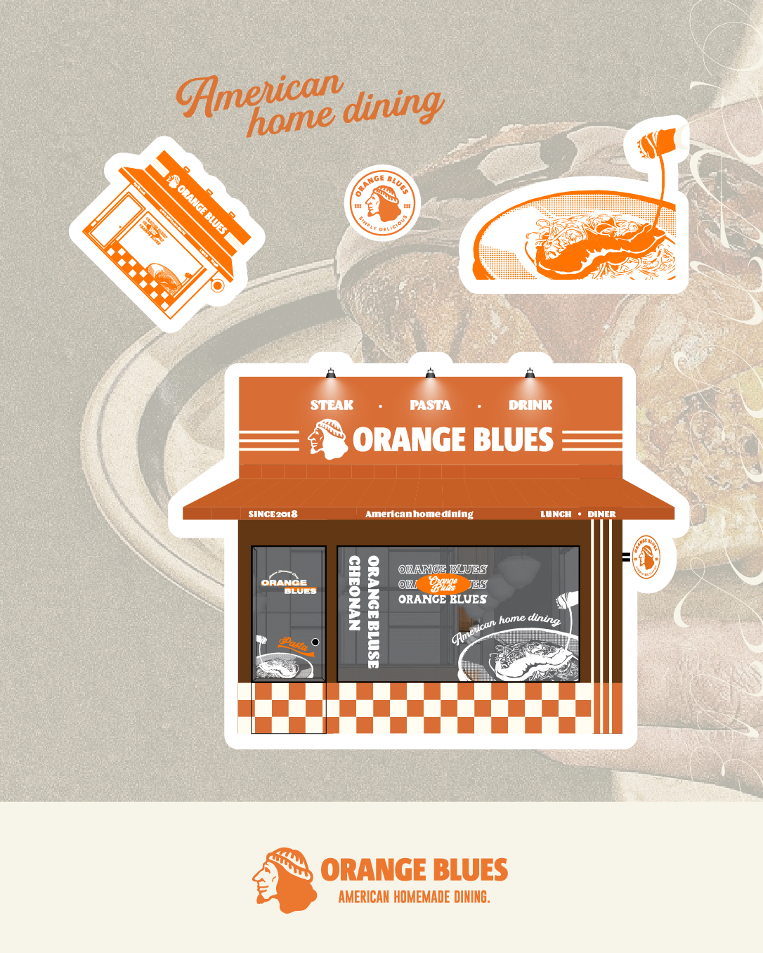
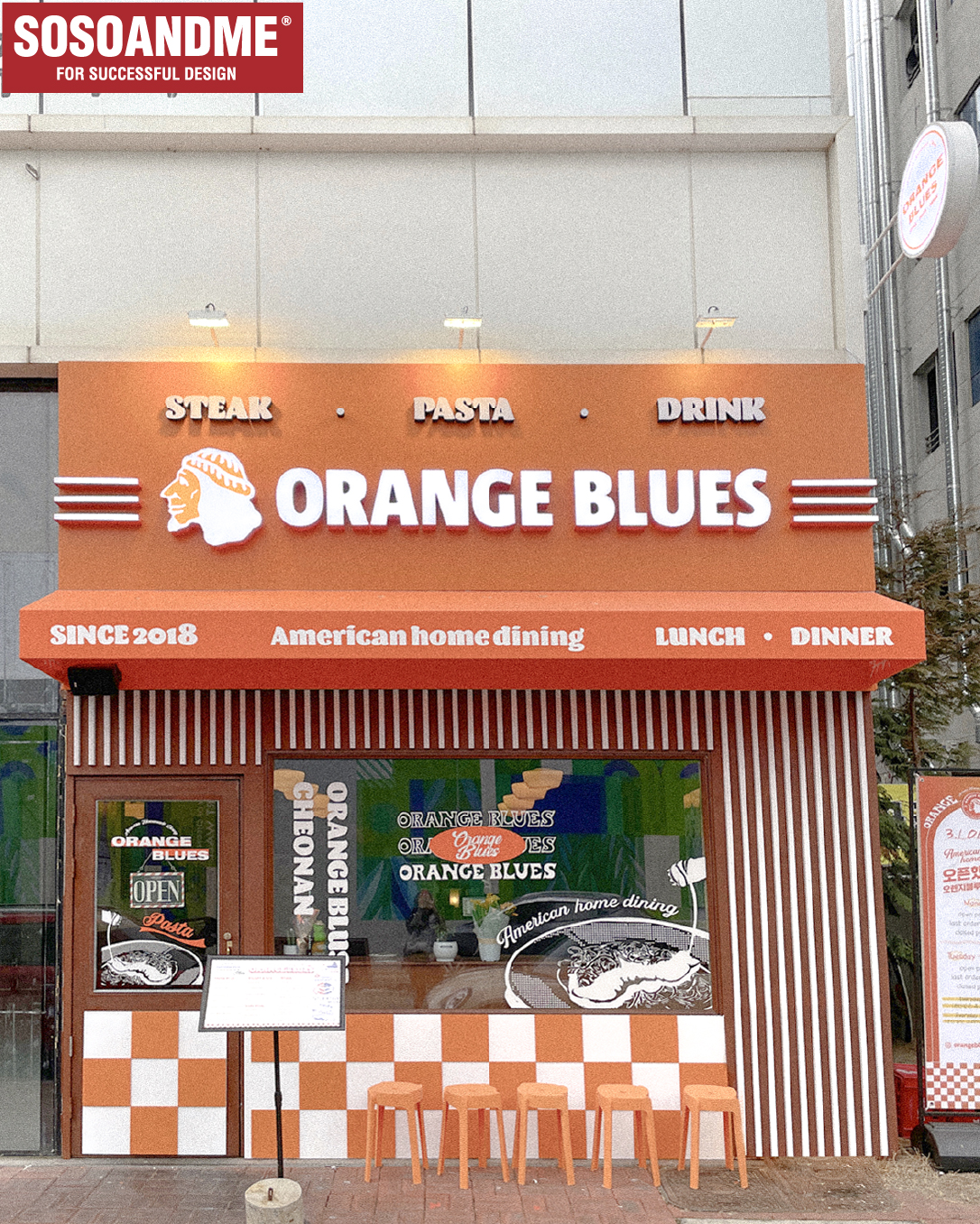
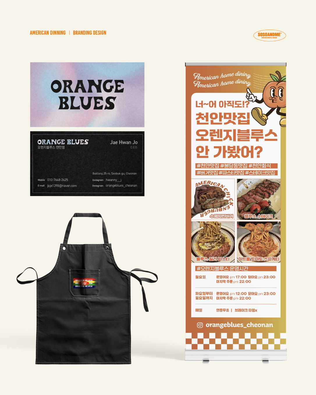
ORANGE BLUES
Orange Blues is a pub infused with American sensibility.
Using orange as the key color, the front visual design captures the vintage street mood reminiscent of 1990s American films.
The design was created by reinterpreting and reconstructing Orange Blues’ unique trendy patterns, giving it a distinctive and stylish identity.
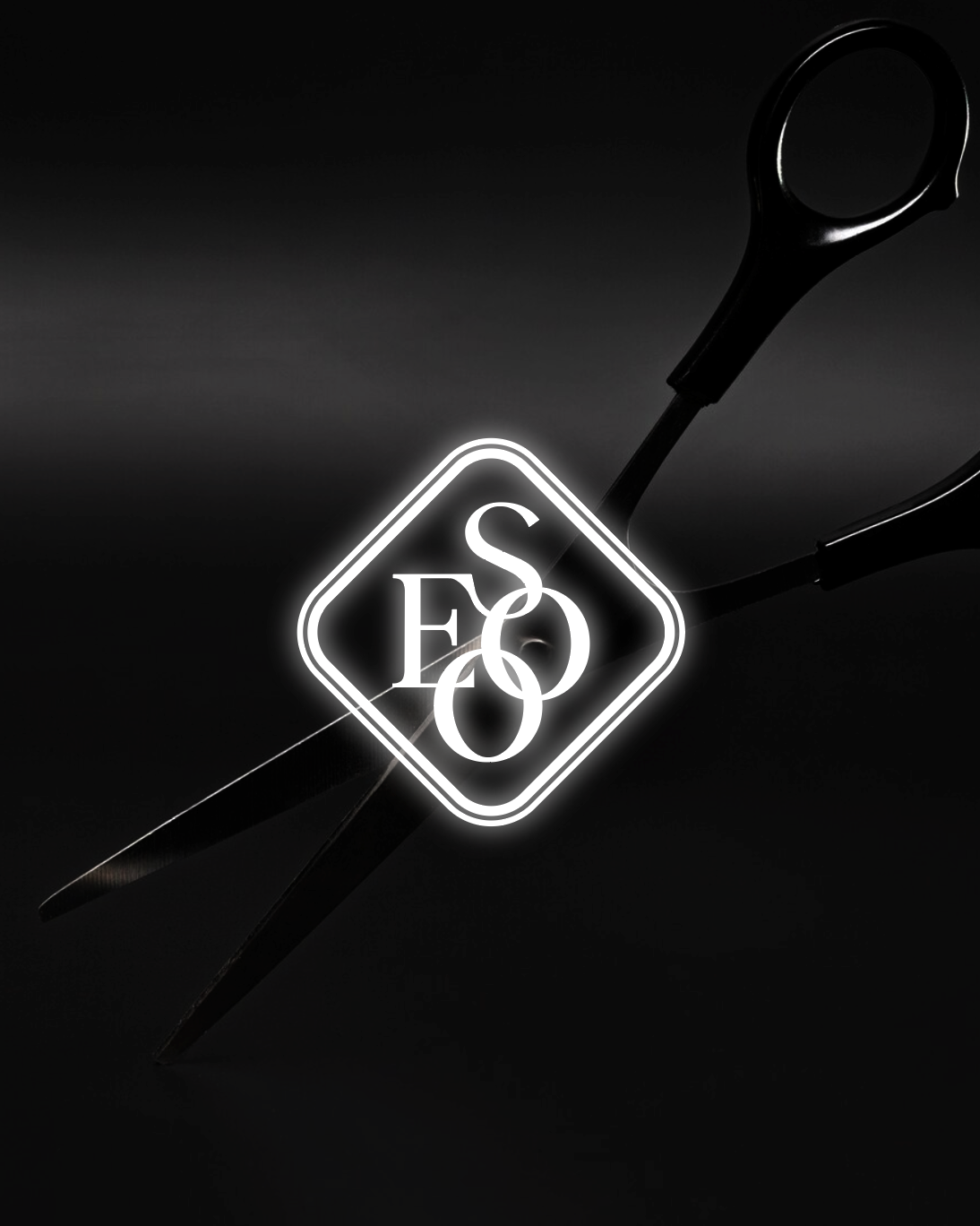
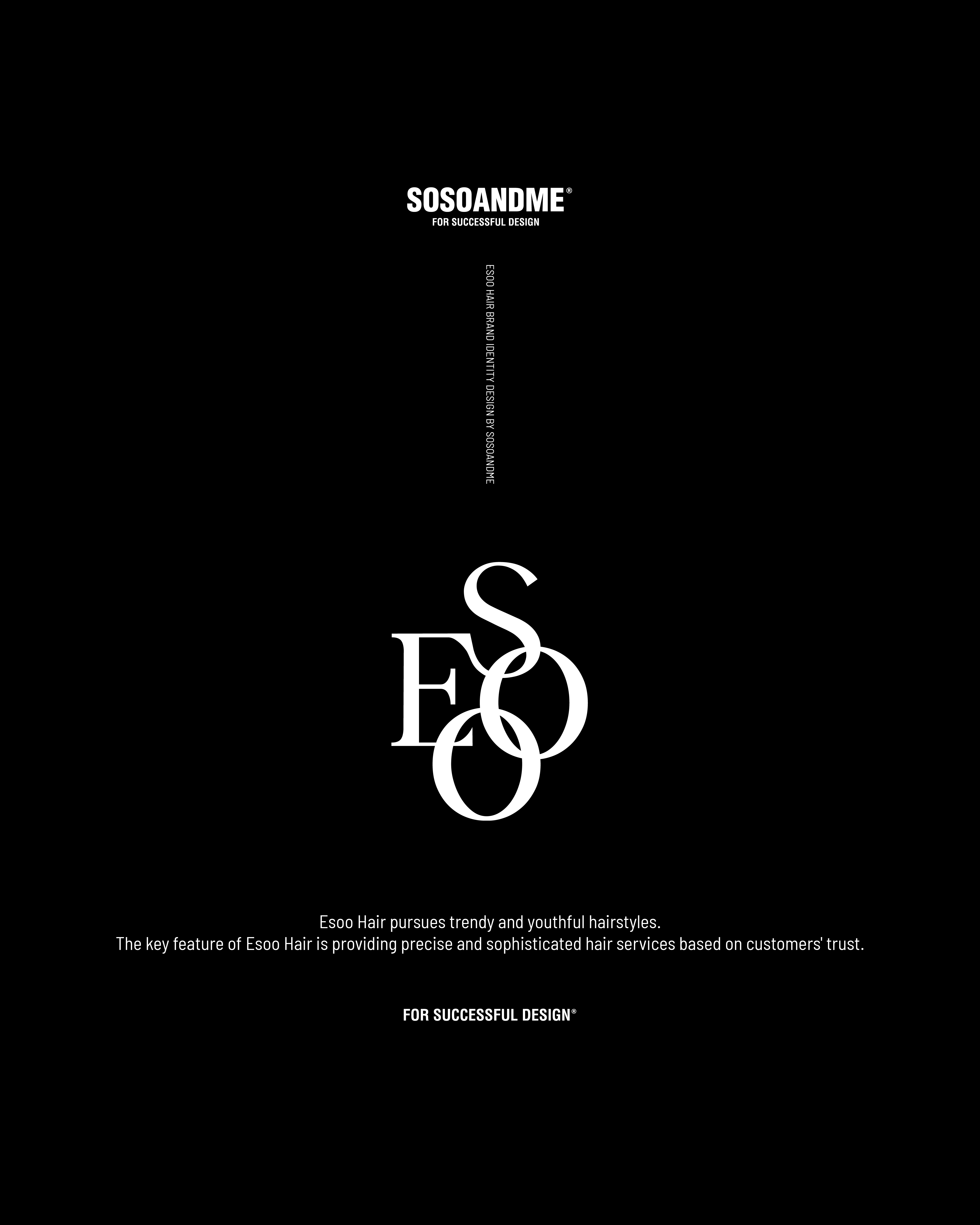
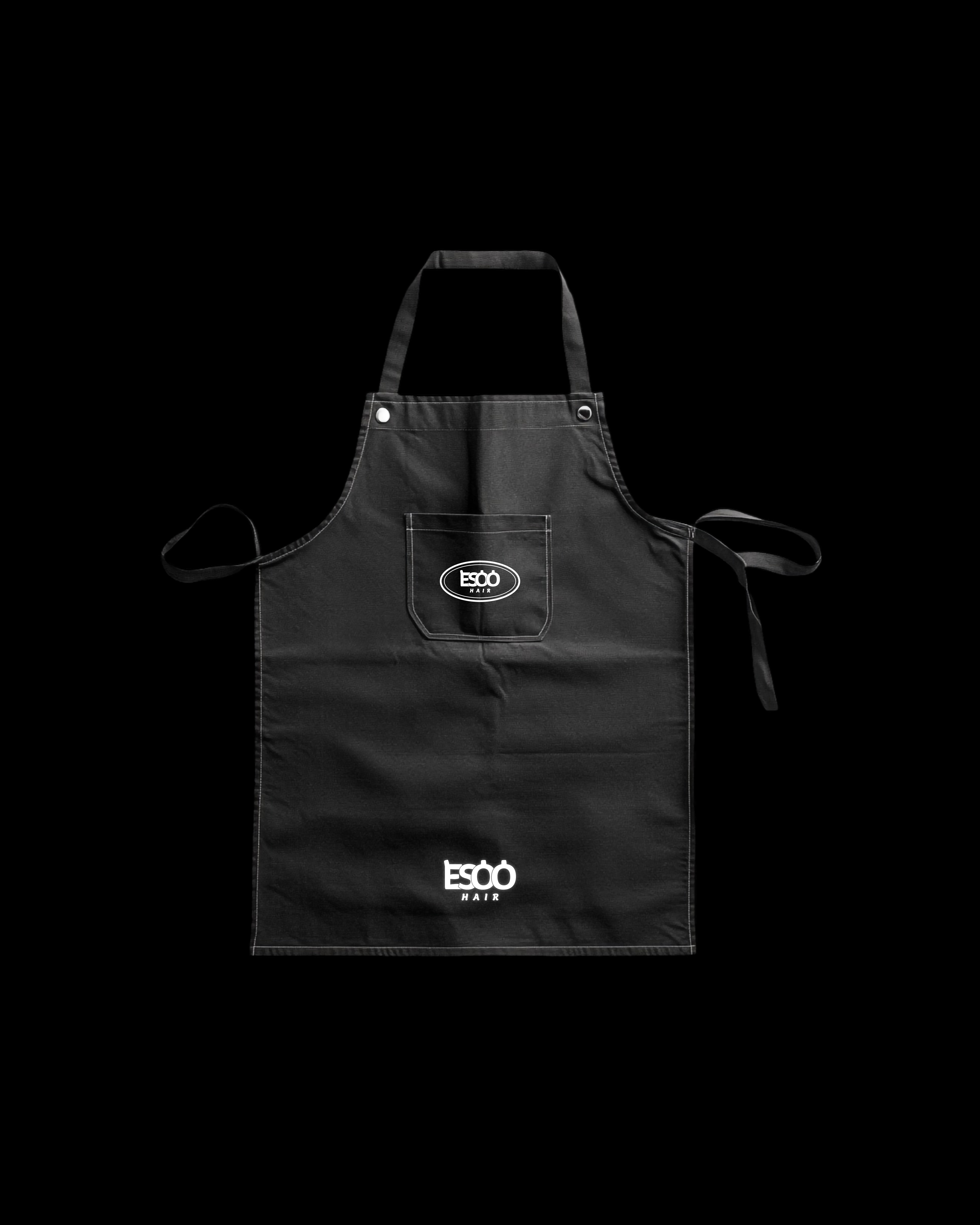
ESOO HAIR
The slogan of ESOO Hair, “Make the customer your friend,” embodies a value that goes beyond a simple beauty service. It reflects a brand philosophy centered on connection, built on genuine relationships with customers, and represents the identity of a salon that aspires to be a warm, people-oriented space.
The logo design, with its interconnected lettering, symbolizes connection and harmony. The interlacing arrangement visually expresses the brand identity of strong human relationships and the bonds formed between people.